

Project Overview
Music isn’t just something I hear: It’s how I feel, heal, and create. Mooder transforms that feeling into an interactive, emotional experience by merging sound with color and mood. It’s more than a music player. It’s a space to visualize your emotions, express your identity, and connect with people who vibe on the same emotional frequency.

How might we help young music lovers share their personal musical style and mood with like minded communities?
How might we help young music lovers share their personal musical style and mood with like minded communities?
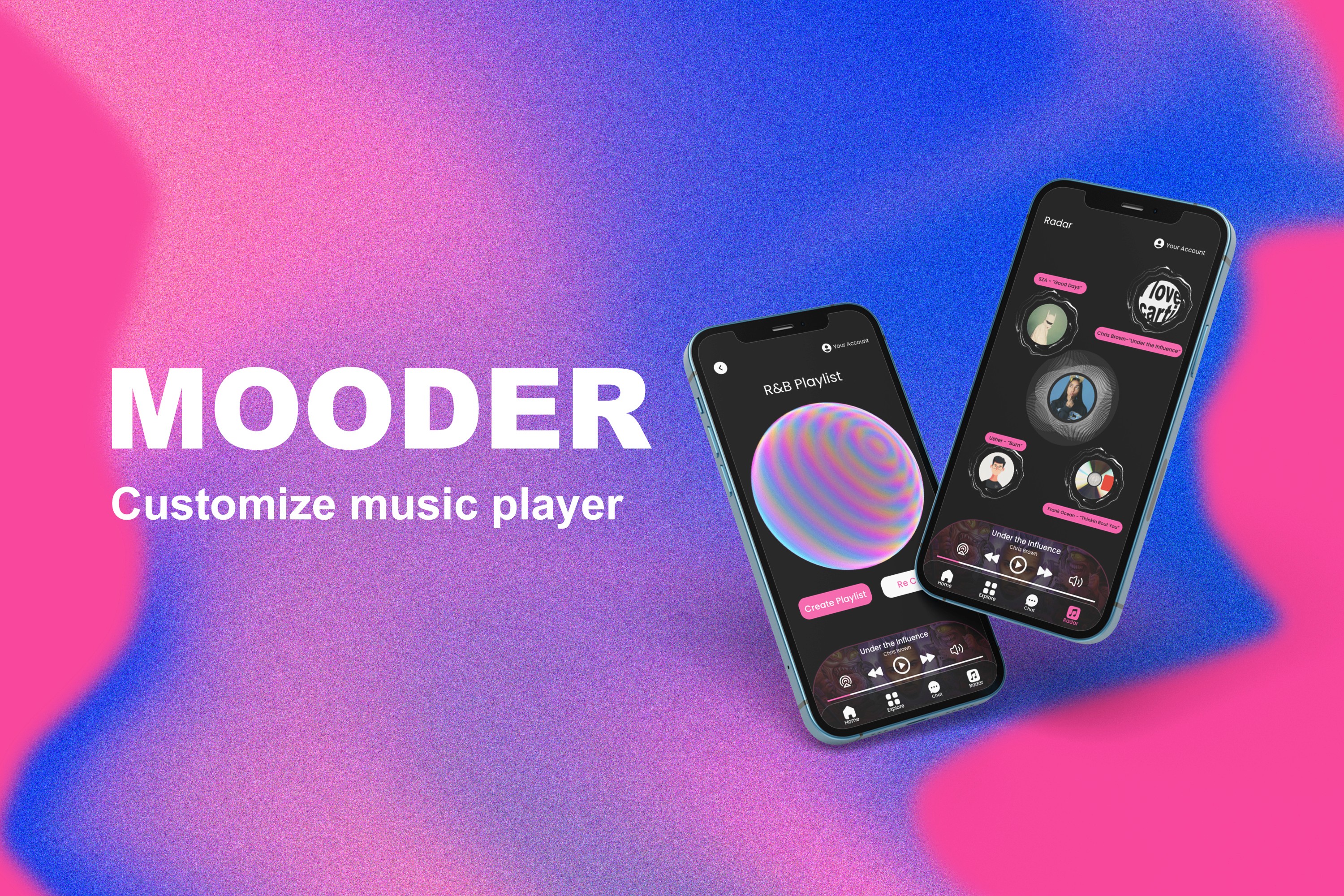
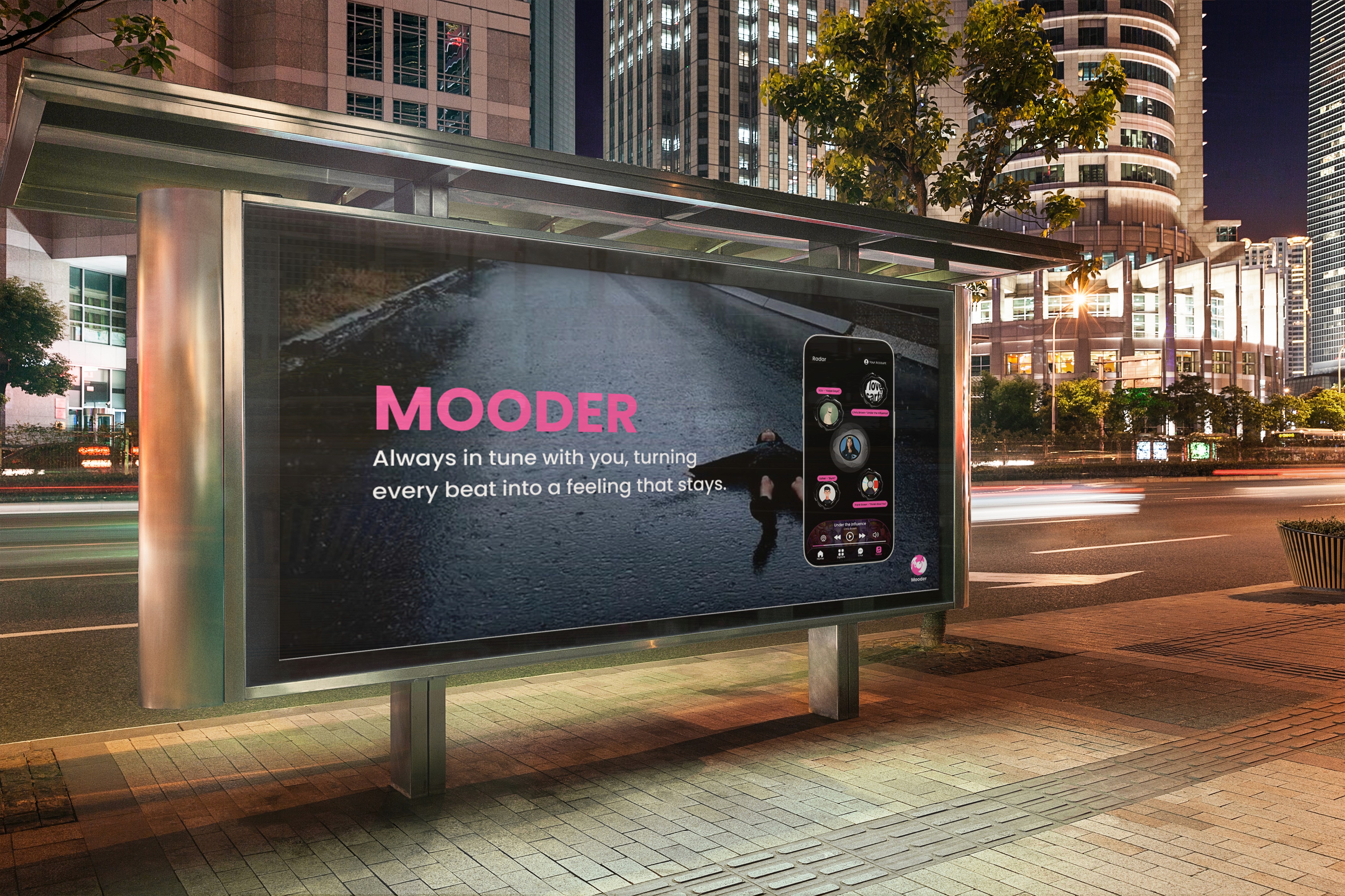
Mooder always in tune with you, turning every beat into a feeling that stays.
Mooder always in tune with you, turning every beat into a feeling that stays.
Mooder always in tune with you, turning every beat into a feeling that stays.
Mooder always in tune with you, turning every beat into a feeling that stays.
Mooder always in tune with you, turning every beat into a feeling that stays.
Mooder always in tune with you, turning every beat into a feeling that stays.

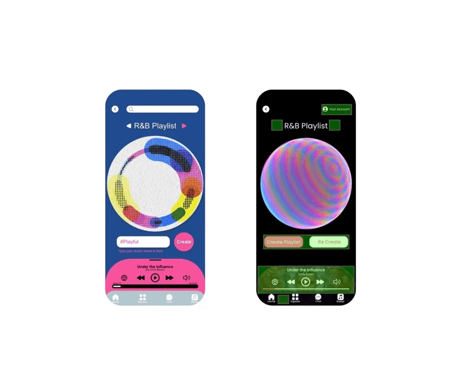
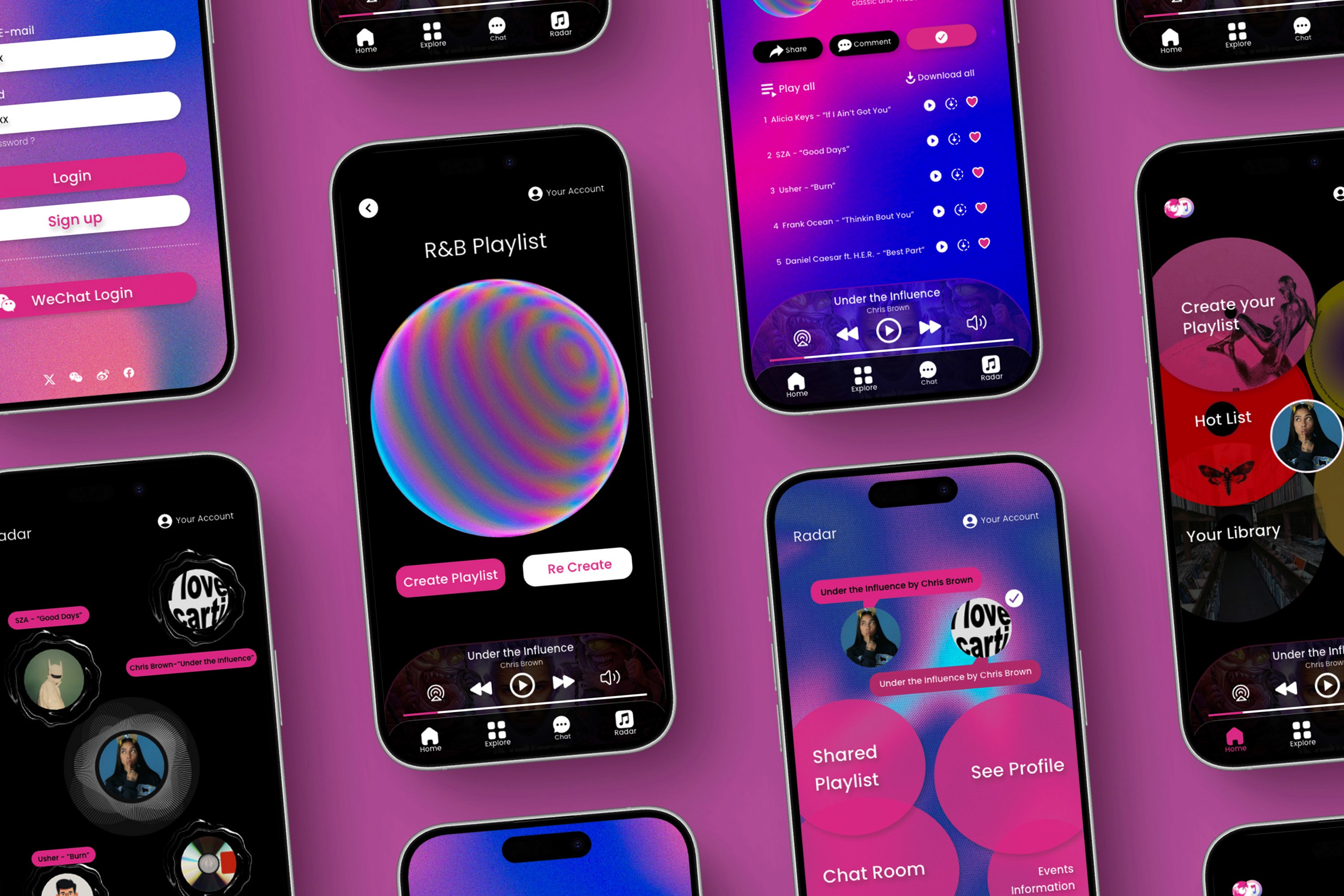
The Solution
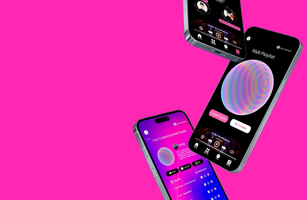
Mooder turns music into a visual, emotional experience. By curating playlists based on your mood and generating a personalized color palette that reflects your vibe. Users can share their music emotions on social media, connect with others listening to the same track, and discover “music soulmates.” It transforms listening into a dynamic, interactive journey that bridges sound, feeling, and real connection.

The Solution
Mooder turns music into a visual, emotional experience. By curating playlists based on your mood and generating a personalized color palette that reflects your vibe. Users can share their music emotions on social media, connect with others listening to the same track, and discover “music soulmates.” It transforms listening into a dynamic, interactive journey that bridges sound, feeling, and real connection.

Persona
“I’m not just looking for songs, I’m looking for a sound that understands me, and someone who does too."
—Mark, 23, NY, College Student
Persona
“I’m not just looking for songs, I’m looking for a sound that understands me, and someone who does too."
—Mark, 23, NY, College Student
Persona
“I’m not just looking for songs, I’m looking for a sound that understands me, and someone who does too."
—Mark, 23, NY, College Student
Persona
“I’m not just looking for songs, I’m looking for a sound that understands me, and someone who does too."
—Mark, 23, NY, College Student
Persona
“I’m not just looking for songs, I’m looking for a sound that understands me, and someone who does too."
—Mark, 23, NY, College Student
Persona
“I’m not just looking for songs, I’m looking for a sound that understands me, and someone who does too."
—Mark, 23, NY, College Student
Persona
“I’m not just looking for songs, I’m looking for a sound that understands me, and someone who does too."
—Mark, 23, NY, College Student
Persona
“I’m not just looking for songs, I’m looking for a sound that understands me, and someone who does too."
—Mark, 23, NY, College Student
Persona
“I’m not just looking for songs, I’m looking for a sound that understands me, and someone who does too."
—Mark, 23, NY, College Student

Audience Interview
Audience Interview
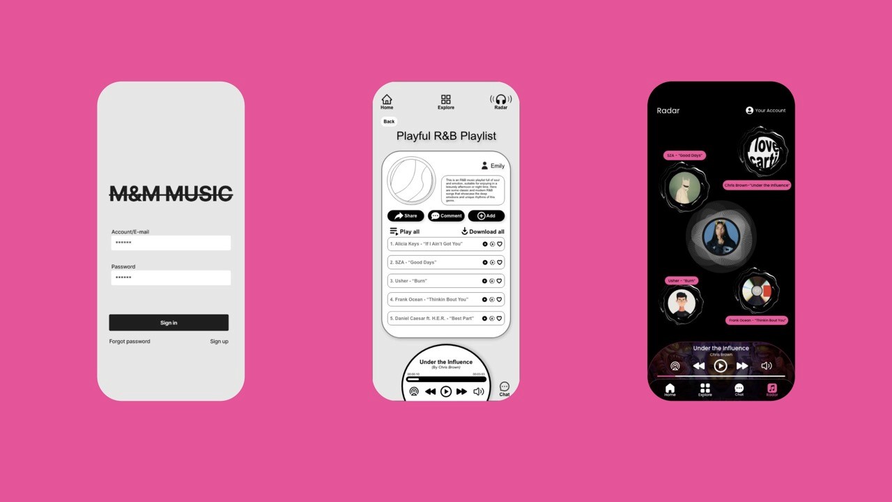
On March 13, 2024, I interviewed Roger Muller, an experienced creative director, via Zoom. He appreciated Mooder's clear and easy-to-use interface, especially the dynamic circle design. His feedback emphasized the importance of defining our target users whether they prefer passive listening or a fully immersive experience. He also highlighted opportunities to build a music sharing community, with features like clear lyric displays and interactive, socially driven engagement.
On March 13, 2024, I interviewed Roger Muller, an experienced creative director, via Zoom. He appreciated Mooder's clear and easy-to-use interface, especially the dynamic circle design. His feedback emphasized the importance of defining our target users whether they prefer passive listening or a fully immersive experience. He also highlighted opportunities to build a music sharing community, with features like clear lyric displays and interactive, socially driven engagement.
On March 13, 2024, I interviewed Roger Muller, an experienced creative director, via Zoom. He appreciated Mooder's clear and easy-to-use interface, especially the dynamic circle design. His feedback emphasized the importance of defining our target users whether they prefer passive listening or a fully immersive experience. He also highlighted opportunities to build a music sharing community, with features like clear lyric displays and interactive, socially driven engagement.
Basic Info: Date: 3/13/2024, Location: Virtual Interview via Zoom Duration: 35 minutes, Contacted yet? Yes

Task Flow
Task Flow
Task Flow
Measurable Outcome
Mooder makes it easy to find your music soulmate by sharing what you feel through sound. No more awkward party chats, just real connections through songs you love. By matching users through live listening and mood based playlists, Mooder turns music into a fun, emotional way to meet like-minded people.
The testing environment: In Class 4/25/2024, Halldora Sif Einarsdottir
A/B Testing Feedbacks
A/B testing showed users struggled with abstract icons and muted colors, making navigation unclear. I refined shapes, layout, and added guiding text. Next, I’ll fine-tune element sizes and ripple effects to ensure smoother, more intuitive interaction throughout the app.
Key Findings
The Found playlist is a bit tricky, I would just change the task description a bit for that!
I feel like the the UI is very creative, but because of this a lot of people may have a difficult time navigating through the interface.

How I solved problem
Based on A/B testing, I learned that color choice and spacing between text and UI elements significantly impact usability. To prevent users from misclicking or completing the wrong tasks, I refined the color scheme and adjusted spacing between bars and UI components, resulting in a clearer, more intuitive, and refreshing interface.
MOODER
Your music bestie
MOODER
Your music bestie
MOODER
Your music bestie
Second Components
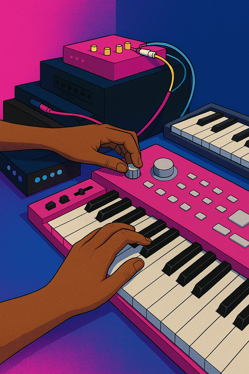
For the second component, I designed bold, emotion driven visuals that reflect MOODER’s core identity. I created three posters, a subway ad series, and a dynamic motion poster—each using minimal text and shifting color to express the brand’s emotional tone, visual rhythm, and connection between music, feeling, and identity.
Second Components
For the second component, I designed bold, emotion driven visuals that reflect MOODER’s core identity. I created three posters, a subway ad series, and a dynamic motion poster—each using minimal text and shifting color to express the brand’s emotional tone, visual rhythm, and connection between music, feeling, and identity.

Conclusion:
Music is more than just sound, it’s an emotional experience that people want to personalize, visualize, and share. Through user research and testing, I discovered that listeners crave deeper connections, both with their music and with others who share their taste. A seamless, intuitive, and immersive experience is key to making this vision a reality.


